![[object Object]](/_next/image?url=https%3A%2F%2Fcdn.sanity.io%2Fimages%2Fei1axngy%2Fproduction%2Ff83f8e24d1fb84d1211763941d7874ed6b2a2da8-281x285.jpg&w=256&q=75)
by Prof Tim Dodwell
Updated 22 June 2023
Receiver Operating Characteristic Curve...the What, Why and How
![[object Object]](/_next/image?url=https%3A%2F%2Fcdn.sanity.io%2Fimages%2Fei1axngy%2Fproduction%2F84ffabea015ee6e500fe33e730cd16e3736a6c35-400x318.jpg&w=2048&q=75)
I have to admit that the Receiver Operating Characteristic curve is probably one of the least memorable names in Machine Learning! Well for one, everyone shortens it to the ROC curve. I had to google the name's background, and it apparently originates from signal detection theory initially developed during World War II. The finer details of which I will let you discover the history of the roc curve.
In this explainer, we will look at what the roc curve communicates for a classification model, and then give particular attention to the area under the curve (or auc). We will try and show this in the context of a walkthrough example in Python as well, where we look at a diabetes example.
This explainer is based on part of a lesson from our Foundations in Machine Learning course. Watch the lesson video below and if you want to learn more about machine learning, check out the course (and our other free preview lessons).
Binary Classification Tasks in Machine Learning
ROC curves are primarily used to compare the performance of models for binary classification tasks. A binary classification model is a statistical model used for supervised learning tasks, where given a set of inputs the machine returns a probability for which the outcome is "TRUE".
For example, does a person have diabetes based on a whole set of measurements of aspects of their health (a real example we look at later), is a great example in clinical epidemiology and medical decision-making of a binary classification problem.
Typically when we build a binary classification model, we will split our data between a training and testing set. The model will be trained on the training set (there is a surprise). But we will validate our model on the testing set. We can then visualise for each of the test examples how we did.
A simple way to visualise this is in a confusion matrix, where we identify one of four possible outcomes
-
The model predicts "yes" and the label is "yes" - TRUE POSITIVE
-
The model predicts "no" and the label is "no" - TRUE NEGATIVE
-
The model predicts "yes" and the label is "no" - FALSE POSITIVE
-
The model predicts "no" and the label is "yes" - FALSE NEGATIVE
By counting the numbers of each of these, we can collect them into a confusion matrix. Where one axis shows predicted, the other shows the true labels. The best predictive models have only values in outcomes 1 and 2 (along the diagonal of the confusion matrix). Off-diagonal entries represent errors, either False positives or False Negatives.
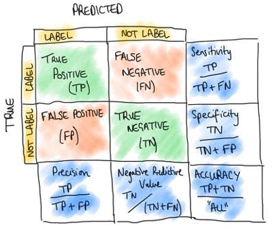
Figure 1. Confusion matrix demonstrates the performance of classification models over the testing set.
False Positive Rate and True Positive Rate
Before we start constructing ROC curves, we need to calculate two key metrics: True Positive Rate (TPR) and False Positive Rate (FPR).
TPR is also called the sensitivity or recall of the classification models. It represents the proportion of actual positive instances correctly classified as positive by the model. Therefore is given by the formula as
Where TP are the True Positives and are the false negatives. Equally, we can have a False Positive Rate, which gives the proportion of all negatives incorrectively classified as positive, and hence has the formula
where FP are the False Positives and the true negatives.
Receiver-Operating Characteristic Analysis for Evaluating Classification Models
Now we have our True Positive and False Positive rates sorted, we are in a position to plot a ROC curve!
A Receiver Operating Characteristic (ROC) curve is a graphical representation that illustrates the performance of a binary classification model across various classification thresholds. It helps assess the model's ability to discriminate between the classes and determine an optimal threshold for classification.
To understand the ROC curve, let's consider a binary classification problem where we have a model that predicts whether an email is spam or not spam. The model's output can be a probability or a score indicating the likelihood of an email being spam. We can then set a threshold, above which we classify the email as spam, and below which we classify it as not spam.
To construct an entire ROC curve, we vary the classification threshold of the model, moving from the highest probability/score to the lowest. For each threshold, we calculate the TPR and FPR values. The calculated TPR and FPR pairs are then plotted on a graph with TPR on the y-axis and FPR on the x-axis.
Here is a sketch of a typical roc curve, which is a nice way of displaying the classification model.
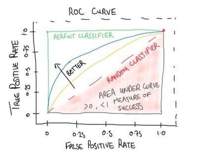
Figure 2. Sketch of ROC so we can walk through the key features!
The ROC curve typically starts at the point (0, 0) and ends at the point (1, 1). So why is this?
If we start with the highest classification threshold value(1.0) then this means that only in an outcome in which you are completely certain will you have any positive outcomes from your algorithm. So in general at a threshold of 1.0, this means both the True Positives and the False positives will be zero, and with this the True and False positive rates. At the other end of threshold values, we will have a classification threshold of 0.0, all samples will be classified as positive. In this case, the True Negatives and False Negatives will be zero, and with this, the True and False positive rates will both be 1.
As we sweep through the classification threshold values from 1.0 down to 0.0, we plot the entire roc curve. A diagonal line from the bottom left corner to the top right corner represents a random classifier with no predictive power. The closer the ROC curve is to the upper left corner of the graph, the better the model's performance. So in the ROC curve above we see that the classification models represented by the blue curve are better than that represented by the yellow curve. This is the nice thing that the ROC curve shows an easy representation or visualisation when comparing two classification models.
Area Under the ROC Curve (aka AUC) and what it tells us
The area under the ROC curve (AUC) is also used as a metric to evaluate the over model's performance or diagnostic ability. A perfect classifier has an AUC of 1, while a random classifier has an AUC of 0.5. The AUC provides a summary or averagemeasure of the model's ability to distinguish between the classes across all possible thresholds.
An AUC of 0.8 suggests that the model has a high probability of assigning higher scores or probabilities to the positive instances compared to the negative instances. It means that, on average, the model correctly ranks 80% of the positive instances higher than the negative instances.
What is the Optimal Threshold?
The optimal threshold for an ROC curve depends on the specific context and requirements of the problem at hand. There is no universally applicable optimal threshold for all scenarios. The choice of threshold depends on the relative importance of false positives and false negatives in the specific application.
To determine the optimal threshold, you need to consider the costs and consequences associated with different types of classification errors.
For example, in a medical diagnosis scenario, false negatives (misclassifying a disease as non-disease) might have severe consequences, while false positives (misclassifying a non-disease as a disease) may lead to further testing or unnecessary treatment. In such a case, you may want to select a threshold that minimizes false negatives even if it means accepting a higher number of false positives.
Conversely, in a spam email detection system, false positives (legitimate emails classified as spam) can be highly disruptive to users, while false negatives (spam emails classified as non-spam) might be less critical. Here, you might want to select a threshold that minimizes false positives, even if it leads to a slightly higher number of false negatives.
Therefore, the optimal threshold is a subjective decision that should be based on the specific application, taking into account the costs and consequences associated with different types of classification errors. The ROC curve helps in visualizing the trade-off between the true positive rate and false positive rate, allowing you to make an informed decision about the threshold based on the desired balance between sensitivity and specificity.
Constructing a ROC curve
Now it is time to put our discussion into practice and construct a ROC curve from a real classification model. For this example, we use a dataset from Kaggle
https://www.kaggle.com/datasets/uciml/pima-indians-diabetes-database/download?datasetVersionNumber=1
This is a data set of Indian women with various measurements and the outcome of whether they had diabetes or not. We are going to build a classification model using logistic regression to try and predict the result of these tests. From the classification model
Wrangling the Data to nice and
import numpy as np
import pandas as pd

df  = pd.read_csv('diabetes.csv', sep=',')
df.head()

We can see there are 9 coloumns, and in total 768 entries, we can see this by calling the following
df.info()
Ok, to let us pull out some feature (or input) columns we are interested in. and then assign y to the outcome (did they have diabetes or not?)
feature_cols = ['Pregnancies', 'Glucose', 'BloodPressure', 'SkinThickness','Insulin','BMI','DiabetesPedigreeFunction', 'Age']

X = df[feature_cols]
y = df.Outcome
Train / Test Split
As normal we will split out data into training data and testing data
from sklearn.model_selection import train_test_split

X_train, X_test, y_train, y_test = train_test_split(X, y, test_size=0.25, random_state= 16)
Fitting a Logistic Model
Now we are in a good position to fit our logistic model, and then use the train model to predict our testing data
from sklearn.linear_model import LogisticRegression

logreg = LogisticRegression(solver='liblinear')

logreg.fit(X_train, y_train)

y_pred = logreg.predict(X_test)
Plotting a Confusion Matrix
So how did we do? Let us plot a confusion matrix to see how the classification did!
import matplotlib.pyplot as plt
import seaborn as sns
from sklearn import metrics

cnf_matrix = metrics.confusion_matrix(y_test, y_pred)

class_names=[0,1] # name  of classes
fig, ax = plt.subplots()
tick_marks = np.arange(len(class_names))

plt.xticks(tick_marks, class_names)
plt.yticks(tick_marks, class_names)

sns.heatmap(pd.DataFrame(cnf_matrix), annot=True, cmap="YlGnBu" ,fmt='g')

ax.xaxis.set_label_position("top")
plt.tight_layout()
plt.title('Confusion matrix', y=1.1)
plt.ylabel('Actual label')
plt.xlabel('Predicted label')
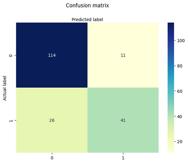
Figure 3. Demonstration of a confusion matrix for our diabetes example, where we show all possible outcomes of the binary classification problem over the testing set
Let's Plot our ROC curve
Next we can look at a ROC_Curve as well
y_pred_proba = logreg.predict_proba(X_test)[::,1]

fpr, tpr,  = metrics.roccurve(y_test,  y_pred_proba)

auc = np.around(metrics.roc_auc_score(y_test, y_pred_proba), decimals = 2)

plt.plot(fpr,tpr,label="data 1, auc="+str(auc))

plt.plot([0.0, 1.0], [0.0, 1.0], '-k', alpha=0.4, label="Random Classifier")

plt.xlim([-0.01, 1.0])
plt.ylim([0.0, 1.01])

plt.xlabel("False Positive Rate")
plt.ylabel("True Positive Rate")

plt.legend(loc=4)
plt.show()

Figure 4. ROC curve for our classification model, here we use a statistical model called logistic regression. The area under the curve for this classification model is 0.87, so generally pretty good.
Take Home Message on ROC Curves and AUC
In summary, the ROC curve visually displays the trade-off between the true positive rate and the false positive rate at different classification thresholds. It helps in understanding the discriminatory power of a binary classification model and selecting an appropriate threshold based on the specific requirements of the problem. On the simple level both the plot at the measure of Area under the curve give us a simple quantative way to determine the quality of classification model.
Featured Posts
If you found this post helpful, you might enjoy some of these other news updates.
Python In Excel, What Impact Will It Have?
Exploring the likely uses and limitations of Python in Excel

Richard Warburton
Large Scale Uncertainty Quantification
Large Scale Uncertainty Quantification: UM-Bridge makes it easy!

Dr Mikkel Lykkegaard
Expanding our AI Data Assistant to use Prompt Templates and Chains
Part 2 - Using prompt templates, chains and tools to supercharge our assistant's capabilities

Dr Ana Rojo-Echeburúa